By Peter Hossli (Text) and Charly Kurz (Fotos)
 It’s five o’clock in the evening in Manhattan. Thousands of cab drivers change shifts with their colleagues. Every ten seconds a yellow car drives up the curb of Evan Auto, a repair shop on the West Side. Tired drivers leave their vehicles. Cleaning personnel fettle backseats. Mechanics check motors. A guy fills up tanks. New drivers board cabs and drive on.
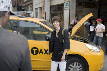
All of a sudden, everything seems to stop. A graceful young woman with a shag of brown hair greets the busy crowd “Hi, my name is Claudia, I designed this logo”. She points to one of the parked cabs. “What, you made this?” answers a rough looking guy. “It’s really ugly”. He boards a cab and drives away. “New York is a great place”, says Claudia Christen, a designer who originally came to New York from Switzerland. “Here, everybody is brutally honest”. She cheers up, as Evan’s chief mechanic wants to have his picture taken with her. “I’ll put it on My Space”, he says. Another joins the conversation. “Your work is totally cool”, says a cab driver that originally moved here from Ghana in West Africa. “Now you must be a millionaire”, he says, his English still broken. In his eyes, Christen achieved what he also wants: Success in America. Even better: Success in New York. “I’m not rich”, she says, “but I’m living the American dream”. As an immigrant who’s made it.
Indeed. There are only a few true global icons. Elvis is one, the iPod or the Nike swoosh. Whoever changes one, changes the face of the world. Claudia Christen did exactly that. She was born in a little village called Toffen near Switzerland’s capital Bern. Now she’s changed the logo that is placed on the side of the famous yellow cabs in New York. Since taxis are everywhere, and her logo is constantly seen, Christen has changed the visuals of New York City.
She sits nervously on a black sofa in the bright 18th floor offices of Smart Design, a reputable design firm based in New York. From here, she sees the Hudson River, and deep canyons formed by tall houses – and hundreds of little yellow cabs that whiz along the wide streets. “Sure, I’m very proud to have changed the look of New York”, Christen says. She smiles sassily by thinking about the fact “that my logo will soon be eternalized forever in movies and television shows that are set in New York”. The 34 year-old is very aware that she accomplished what many immigrants dream of: “My work had an real impact.”
 It took a long, and sometimes difficult process. Over a year ago, Smart Design got the assignment to develop the interior of future taxis. First the rather shabby exterior attracted the attention of the designer. It was a makeshift logo that was put together in somebody’s cellar back in the seventies. “It is not even a real design”, Christen says. Her firm made an offer to the City to create a real logo, pro bono. New York gladly accepted. Christen, since 1997 part of Smart Design, got the job. She formed a team with three people and started her research.
First, she looked for old photographs of taxis in archives. Then she analyzed modern European taxi design, especially in Germany and the Netherlands. “People in Europe put much more thought into the look and design of cabs”, she says. She watched Martin Scorsese’s cult classic “Taxi Driver” again, as well as director Jim Jarmush’s taxi-world-trip “Night on Earth”. In addition she interviewed cab drivers and tourists visiting New York. She found that most drivers didn’t care about the old logo, while the visitors were often confused by it.
The new logo needed to be cheap to produce and easy to read, she says. “Besides that, I had no restrictions at all”. It was Christen’s aim to eliminate confusion. She wanted a design that reflects how she sees New York. “New York is a city that constantly grows organically”, she says. “Many things are not super clean or very orderly, New York is still a very rough place in which history is very important”. Her logo should last at least for twenty years. “And it should not be overly designed”.
 She does not apply the same standards to her own appearance. She’s very orderly and cleans her desk before she lets the photographer to snap a picture of it. She doesn’t look like a trendsetter that is changing New York’s design scene. Instead, she’s neat, and wears white Capri pants with a discrete black blouse. Her shaggy hair is cut short. She carries a BlackBerry in her green leather purse but fantasizes of having an iPhone. She takes of her dark rimmed glasses to be photographed.
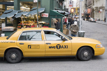
Christen drew roughly 25 different versions of the logo. She also created a new font, which she calls “NYC Taxi Type”. With it she wrote the words “NYC Taxi” as well as the registration number of the cars. In a historic reference to the legendary Checker cabs she brought back the checker pattern on the trunk of the car. She put an iconic looking figure that hails a cab with his arm next to the sign with the fare information. Since New Yorkers as well as tourists see cabs as part of public transportation, Christen put the T of Taxi into a black circle, in reference to the design of the New York subways.
Eventually, mayor Michael Bloomberg approved Christen’s work – with a caveat. The letters NYC had to be replaced with the official, rather chubby brand of the city, even though it does not go well with Christen’s design. Rather grudgingly, Smart Design accepted. Until the end of January, all 26000 New York City cabs will be outfitted with logo of the Swiss designer.
Not every one is pleased with that. Like most new design work in New York, Christen’s work created uproar. On a blog, published by the “New York Times”, it was described as “ugly”, “soon to be outdated” or “it’s official, everybody hates the new taxi logo”. The paper even invited designers to send in their own ideas.
Christen – she grew up in a small country-side village with 2500 inhabitants – takes it surprisingly cool. “Of course, it is a bit tough to read this”, she admits. “But whoever puts herself out there, is taking a risk and does something big, needs to be able to get a lot stick”. Anyway, she says, criticism belongs to New York. “It’s not my design that gets all the blame, it’s the forcefully added NYC-Logo”.
Christen studied design at the Arts School Biel in Switzerland. There she discovered the works of American painter Ed Ruscha, and Robert Frank, the legendary photographer who went from Zurich to New York. With this 1958 book “The Americans” he transformed the way people looked at the United States. Her other inspirations include the films by Wong-kar Wai, Wes Anderson and Sofia Coppola.
Christen was 23 years old when she came to New York, to study English. She stayed. Currently she shares a loft in Greenpoint, an old Polish neighborhood in Brooklyn that was recently discovered by artist. She is single and calls her many friends her family. Her part time job at Smart Design leaves her enough time to follow another passion: photography. With a large format camera she takes pictures of America’s urban landscape. Some day, she hopes, she can publish them as a book. She has no plans to be known just as the woman who designed the taxi logo. “If anything this inspires me to try out new, and more difficult things”.
Like many other immigrants, Christen doesn’t know whether she wants to stay in New York.
“Here, everything is short-lived, a lot of things are thrown away, nothing lasts”, she says. Wistfully she looks towards Europe, “where quality is generally much better than in the United States”. She speaks Italian and can imagine to be living in Milan. “But then again, I’d really miss the international spirit of New York City”.